CASE STUDY
PlanPay – Global Brand Strategy
PlanPay is more than a payments platform. It’s a brand on a mission to change our relationship with money.
Background
Based on the lay-buy model where customers pay for goods and experiences ahead of time so they can enjoy them debt-free, PlanPay is an outlier in our current age of instant gratification. We live in the Buy Now Pay Later era, defined by a lack of friction between desire and purchase, and global platforms offering interest-free payments for everything from designer clothing to weekly groceries. But BNPL is not without its downsides. In addition to driving some customers into perpetual cycles of debt, it’s also lowered the barrier to shopping so much that it has launched an unprecedented era of buyer’s remorse. Easy pay, easy come, easy regret. So, when PlanPay tasked us with designing their brand, we knew we were up against giants, and a consumer primed for barrier free spending. We were up for the fight.
Tension
When customers are primed for instant gratification, how can you convince them that the best experiences come to those who plan?
Approach
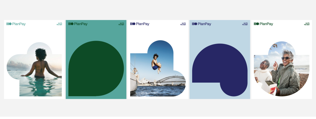
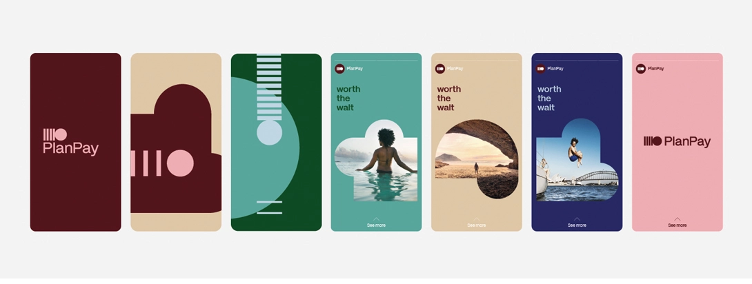
In order to design a brand that would resonate, we went straight to the heart of financial regret. We termed this emotion ‘the financial hangover’ – that empty feeling that follows a spending spree, facilitated by BNPL. Hindsight is 20/20 though, and people generally look back and wish they’d planned better and made more sound choices with their money. So, we made planning look as appealing and glorious as spending, which is how we landed on our brand positioning and strapline, ‘Worth the wait’.
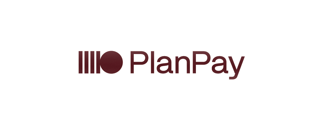
Our approach to identity design was inspired by the brand positioning, from typography to photography style and visual language. At the core of the identity is the PlanPay logo – the Journey Mark – which fuses the core tension in the brand. After careful, rhythmic payments (characterised by the vertical lines in the mark) comes the joyful relief of debt-free experiences, embodied by the circular shape at the tail end. The journey mark is the basis for the brand’s wider visual language, fusing all things PlanPay with a sense of freedom.
“When we first started to work with whiteGREY we had a product we were confident would change the payments landscape and give everyone a smarter way to pay. By the end, we had a brand. ‘Worth the Wait’ and the design work that followed brought our vision to life. whiteGREY understood the category and where we could impact, and turned that into a brand our merchants and their customers could rally behind.” Gary Burrows, CEO PlanPay